NHC Rolls Out New Products in 2026

The National Hurricane Center is always improving and looking for better ways to communicate threats when it comes to Hurricane Season. This year, they're rolling out a handful of new products, with a new cone, website and symbology to talk about.
NEW CONE
They've been toying around with an experimental cone for the past 2 years. This year the National Hurricane Center making it operational. It makes it easier to show inland impacts, especially wind, of a landfalling tropical system. Watch and warnings that pertain to a certain tropical system will now be shown along the cone's path.
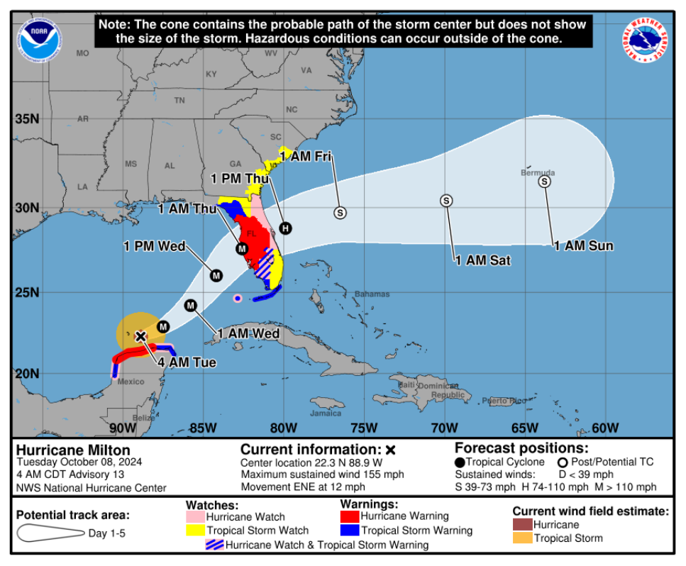
TRACK FORECAST ERROR
Speaking of the cone, which again, is used to show where the center of any particular tropical system will be in the future, is getting trimmed. These cones are built in with a typical error within the forecast. This year, it's shrinking by 4-8% vs last year. In the Pacific Basin, it will be 3-8% smaller vs 2025.
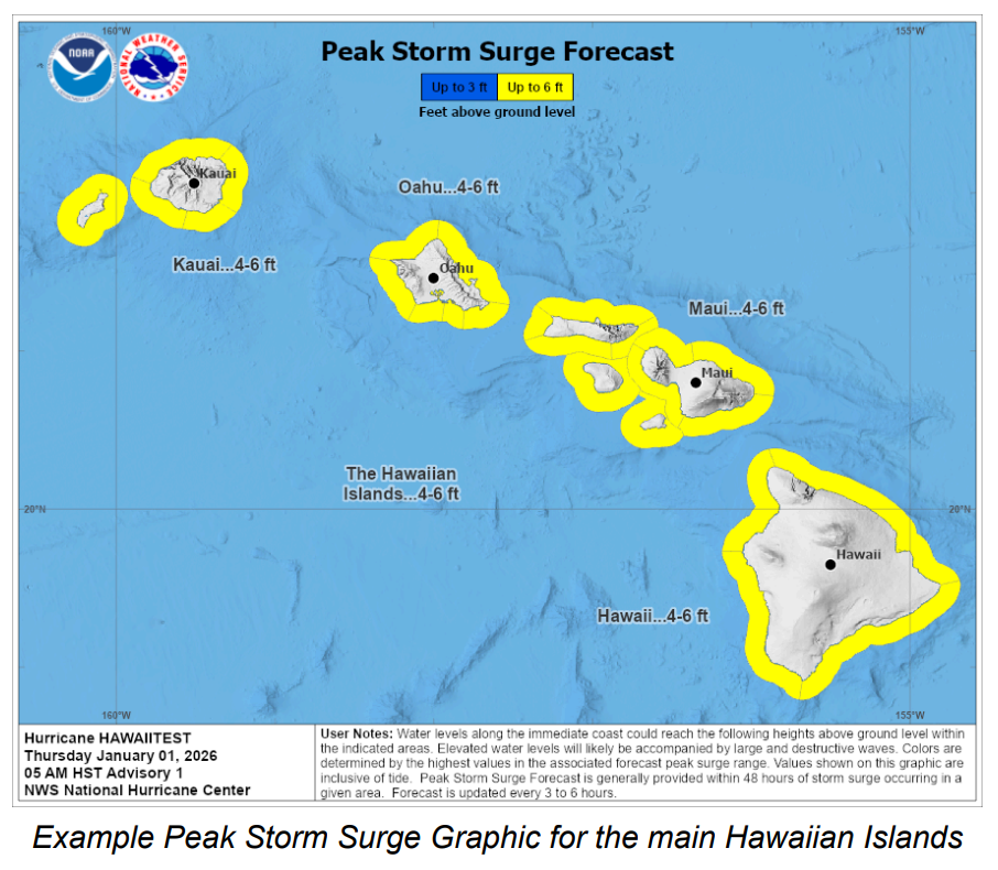
STORM SURGE ALERTS FOR HAWAII
This one's pretty straightforward. The National Weather Service will have the ability to issue Storm Surge Watches and Warnings for the Hawaiian Islands like they do in the lower 48. This will also come with a peak storm surge graphic and a potential inundation map.
Generally, a Storm Surge Watch will come out when the threat is within 48 hours of occurring
Generally, a Storm Surge Warning will come out when the threat is within 36 hours.
A NEW WEBSITE
Hurricanes.gov will get a makeover of sorts. They're beginnging to work on a mobile version that will be more accessible with a bit of a different look.
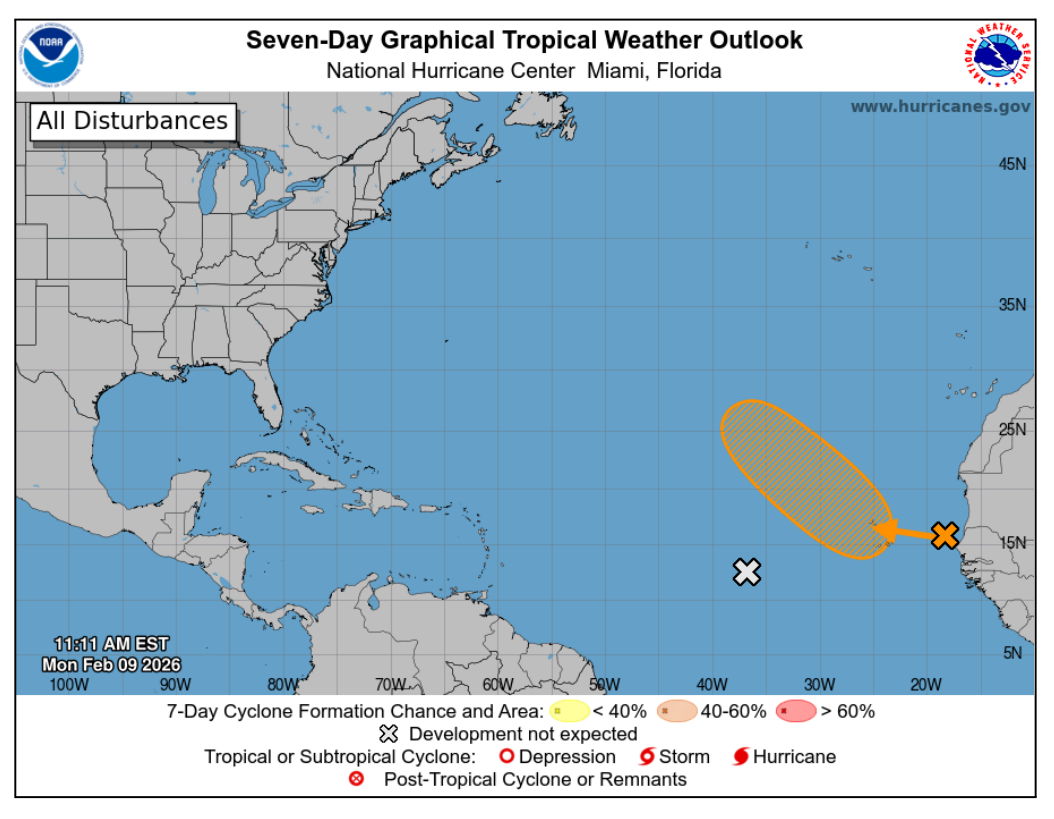
UPDATED SYMBOLOGY
This one has some scary words, but is pretty simple too: anything that is not expected to develop in both the 2 & 7 day timeframe will come with a grey/white X. So now the scale will go
0% | Grey/White
10%-30% | Yellow
40%-60% | Orange
70%+ | Red
Below is an example of what the Tropical Weather Outlook could look like this year