The Madden Julian Oscillation: What is it, and Why it Matters This Winter
Special Stories
23 Feb 2018 8:15 AM
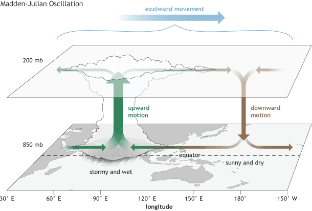
[The surface and upper-atmosphere structure of the MJO for a period when the enhanced convective phase (thunderstorm cloud) is centered across the Indian Ocean and the suppressed convective phase is centered over the west-central Pacific Ocean. Horizontal arrows pointing left represent wind departures from average that are easterly, and arrows pointing right represent wind departures from average that are westerly. The entire system shifts eastward over time, eventually circling the globe and returning to its point of origin. NOAA drawing by Fiona Martin.]
From NOAA by Michelle L'Heureux
It’s now mid-February and while some of us are still dealing with the last vestiges of deep winter (wrapped up in wool blankets, sipping our hot tea, in the glare of our light therapy lamps), I thought it would be a nice time to recap what we’ve seen weather- and climate-wise so far this winter. Official winter for us meteorologists is the months of December-February, and although we’re not quite done, I still want to point out the changes in surface temperature over the U.S. so far because they’ve been really fascinating, likely in part due to the Madden-Julian Oscillation or “MJO.”
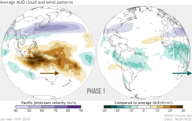 [Averages of all January–March MJO events from 1979–2016. Green shading shows below-average OLR (outgoing longwave radiation, or heat energy) values, indicating more clouds and rainfall, and brown shading identifies above-average OLR (drier and clearer skies than normal). The purple contours show the location and strength of the Pacific jet at the 200-hPa level (roughly 38,000 feet at that location). Note the eastward movement of the wet and dry areas. How far the Pacific jet extends past the international dateline also changes with the phase of the MJO. NOAA Climate animation adapted from original images provided by Carl Schreck.]
Unlike with ENSO, for which we make a big deal about the monthly or seasonal averages rather than shorter-term fluctuations, the MJO is tracked using daily or weekly averages. We even have a way to monitor the MJO up to the current day with this picture called a “phase diagram,” named that way because its divided up into eight stages or eight phases (stay with me, I promise this isn’t advanced math):
[Averages of all January–March MJO events from 1979–2016. Green shading shows below-average OLR (outgoing longwave radiation, or heat energy) values, indicating more clouds and rainfall, and brown shading identifies above-average OLR (drier and clearer skies than normal). The purple contours show the location and strength of the Pacific jet at the 200-hPa level (roughly 38,000 feet at that location). Note the eastward movement of the wet and dry areas. How far the Pacific jet extends past the international dateline also changes with the phase of the MJO. NOAA Climate animation adapted from original images provided by Carl Schreck.]
Unlike with ENSO, for which we make a big deal about the monthly or seasonal averages rather than shorter-term fluctuations, the MJO is tracked using daily or weekly averages. We even have a way to monitor the MJO up to the current day with this picture called a “phase diagram,” named that way because its divided up into eight stages or eight phases (stay with me, I promise this isn’t advanced math):
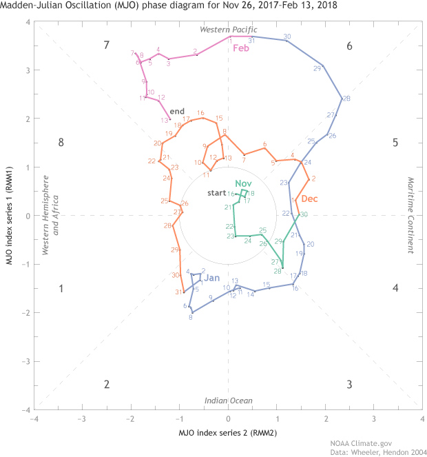 [The MJO index values for each day from November 26, 2017 to February 13, 2018. Days inside of the circle are weak or inactive MJO. Daily movement outside of the circle and in a counter-clockwise direction indicate an active MJO. Data is from Wheeler and Hendon (2004) and image is modified by NOAA Climate.]
As you can see above, for most of this winter the MJO has been alive and well, which is shown by the movement of each day’s value in a counter-clockwise direction (indicated by a dot with a number indicating the day of the month). This counter-clockwise motion implies that the MJO is moving, as it is supposed to, to the east (footnote 2). The stronger an MJO is, the farther the dots lie from the circle. Some of the values so far this winter have been near record strength at times! (check out Phase 6).
The MJO doesn’t always exist. During winter, it is active only about 40-50% of the time. When the MJO is weak or not active, then values in the diagram below will occur more often within the circle at the origin (as was the case in middle-to-late November 2017).
[The MJO index values for each day from November 26, 2017 to February 13, 2018. Days inside of the circle are weak or inactive MJO. Daily movement outside of the circle and in a counter-clockwise direction indicate an active MJO. Data is from Wheeler and Hendon (2004) and image is modified by NOAA Climate.]
As you can see above, for most of this winter the MJO has been alive and well, which is shown by the movement of each day’s value in a counter-clockwise direction (indicated by a dot with a number indicating the day of the month). This counter-clockwise motion implies that the MJO is moving, as it is supposed to, to the east (footnote 2). The stronger an MJO is, the farther the dots lie from the circle. Some of the values so far this winter have been near record strength at times! (check out Phase 6).
The MJO doesn’t always exist. During winter, it is active only about 40-50% of the time. When the MJO is weak or not active, then values in the diagram below will occur more often within the circle at the origin (as was the case in middle-to-late November 2017).
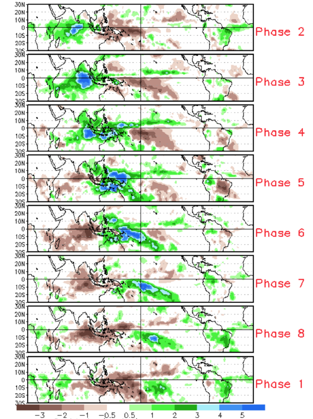 [Difference from average rainfall for all MJO events from 1979-2012 for November-March for the eight phases described in the text. The green shading denotes above-average rainfall, and the brown shading shows below-average rainfall. To first order, the green shading areas correspond to the extent of the enhanced convective phase of the MJO and the brown shading areas correspond to the extent of the suppressed convective phase of the MJO. Note eastward shifting of shaded areas with each successive numbered phase as you view the figure from top to bottom.]
For specifics, check out the average temperature departures associated with the MJO during December–February (DJF) and January–March (JFM) in CPC’s MJO composites page.
[Difference from average rainfall for all MJO events from 1979-2012 for November-March for the eight phases described in the text. The green shading denotes above-average rainfall, and the brown shading shows below-average rainfall. To first order, the green shading areas correspond to the extent of the enhanced convective phase of the MJO and the brown shading areas correspond to the extent of the suppressed convective phase of the MJO. Note eastward shifting of shaded areas with each successive numbered phase as you view the figure from top to bottom.]
For specifics, check out the average temperature departures associated with the MJO during December–February (DJF) and January–March (JFM) in CPC’s MJO composites page.
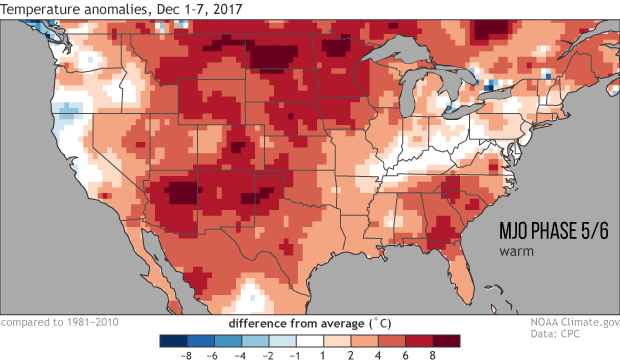 [Surface temperature departures from average across the contiguous United States for consecutive periods during the 2017-18 winter while the MJO was active and in different phases. Blue shading indicates below-average temperatures and red shading indicates above-average temperatures (relative to a 1981-2010 base period). Gridded data is from CPC with graphic modified by NOAA Climate.]
So, the situation thus far this winter has been pretty interesting because we see temperature shifts over the United States that are mostly adhering to this rule of thumb. Can we always expect these types of temperature swings to emerge so clearly? No, it is quite often that specific events (just like among La Niña cases) have a fair number of differences between them.
[Surface temperature departures from average across the contiguous United States for consecutive periods during the 2017-18 winter while the MJO was active and in different phases. Blue shading indicates below-average temperatures and red shading indicates above-average temperatures (relative to a 1981-2010 base period). Gridded data is from CPC with graphic modified by NOAA Climate.]
So, the situation thus far this winter has been pretty interesting because we see temperature shifts over the United States that are mostly adhering to this rule of thumb. Can we always expect these types of temperature swings to emerge so clearly? No, it is quite often that specific events (just like among La Niña cases) have a fair number of differences between them.
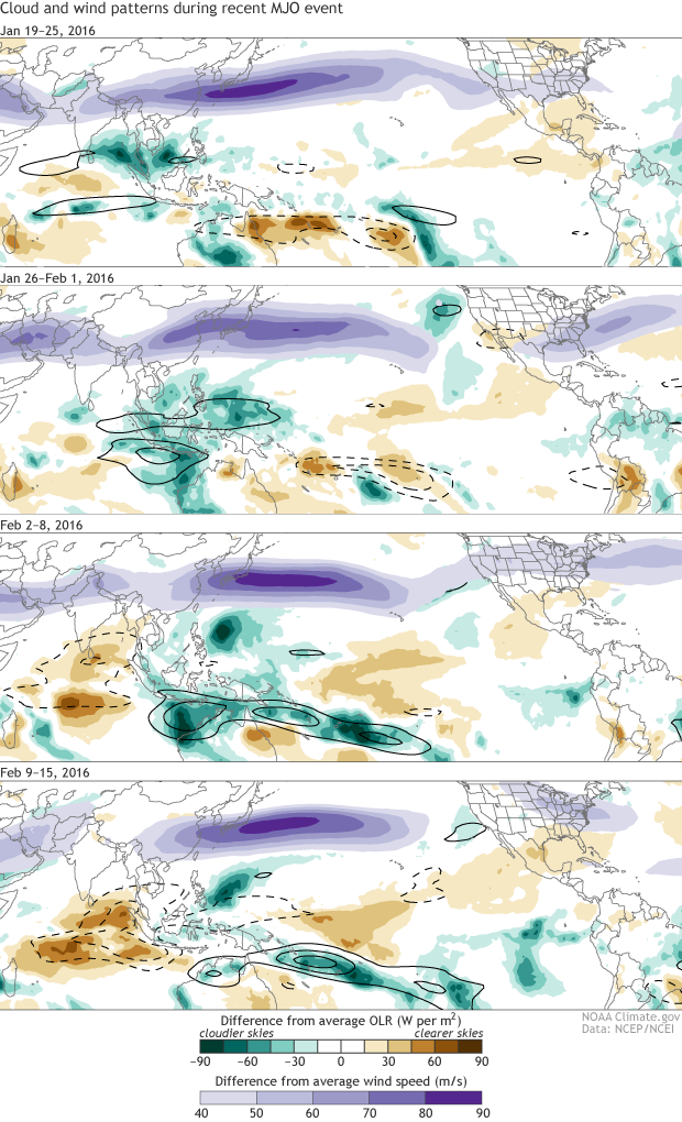 [Clouds and wind patterns for the MJO event that occurred from late-January to mid-February 2016. Black contours highlight the OLR signals directly associated with the MJO. NOAA Climate images adapted from originals by Carl Schreck.]
So, what does the MJO mean for the rest of February and into March? In the past couple of weeks the MJO has stalled out and substantially weakened (link to real time) and there is uncertainty in the future progression of the MJO—some models suggest the MJO will continue to shift eastward and others suggest the MJO will weaken further. And of course there’s that sudden stratospheric warming too, so the next month or so will be interesting to watch! Wait, what?!
Thanks to Dr. Matthew Wheeler (Bureau of Meteorology in Australia) for providing the MJO index data (see Wheeler and Hendon, 2004, for information on the calculation of this index).
[Clouds and wind patterns for the MJO event that occurred from late-January to mid-February 2016. Black contours highlight the OLR signals directly associated with the MJO. NOAA Climate images adapted from originals by Carl Schreck.]
So, what does the MJO mean for the rest of February and into March? In the past couple of weeks the MJO has stalled out and substantially weakened (link to real time) and there is uncertainty in the future progression of the MJO—some models suggest the MJO will continue to shift eastward and others suggest the MJO will weaken further. And of course there’s that sudden stratospheric warming too, so the next month or so will be interesting to watch! Wait, what?!
Thanks to Dr. Matthew Wheeler (Bureau of Meteorology in Australia) for providing the MJO index data (see Wheeler and Hendon, 2004, for information on the calculation of this index).
Wheel o’ MJO
The What? The MJO? This can’t be good! But please hang tight—hey, get your mouse cursor away from the exit button! The Madden-Julian Oscillation is a major fluctuation in tropical circulation and rainfall that moves eastward along the equator (Footnote 1), and circles the entire globe in a span of 30–60 days on average. We’ve already covered the MJO in the ENSO blog and also in the Beyond the Data blog, so if you want more details, head on over to those links and give them a read.
[Averages of all January–March MJO events from 1979–2016. Green shading shows below-average OLR (outgoing longwave radiation, or heat energy) values, indicating more clouds and rainfall, and brown shading identifies above-average OLR (drier and clearer skies than normal). The purple contours show the location and strength of the Pacific jet at the 200-hPa level (roughly 38,000 feet at that location). Note the eastward movement of the wet and dry areas. How far the Pacific jet extends past the international dateline also changes with the phase of the MJO. NOAA Climate animation adapted from original images provided by Carl Schreck.]
Unlike with ENSO, for which we make a big deal about the monthly or seasonal averages rather than shorter-term fluctuations, the MJO is tracked using daily or weekly averages. We even have a way to monitor the MJO up to the current day with this picture called a “phase diagram,” named that way because its divided up into eight stages or eight phases (stay with me, I promise this isn’t advanced math):
[The MJO index values for each day from November 26, 2017 to February 13, 2018. Days inside of the circle are weak or inactive MJO. Daily movement outside of the circle and in a counter-clockwise direction indicate an active MJO. Data is from Wheeler and Hendon (2004) and image is modified by NOAA Climate.]
As you can see above, for most of this winter the MJO has been alive and well, which is shown by the movement of each day’s value in a counter-clockwise direction (indicated by a dot with a number indicating the day of the month). This counter-clockwise motion implies that the MJO is moving, as it is supposed to, to the east (footnote 2). The stronger an MJO is, the farther the dots lie from the circle. Some of the values so far this winter have been near record strength at times! (check out Phase 6).
The MJO doesn’t always exist. During winter, it is active only about 40-50% of the time. When the MJO is weak or not active, then values in the diagram below will occur more often within the circle at the origin (as was the case in middle-to-late November 2017).
Get to the Point. Why does the MJO matter to me?
That’s all very nice, but what does the MJO mean for the United States? Past research (see references below) has shown that even though the MJO is confined to the Tropics, it can still push around the global circulation and impact temperature and precipitation over the United States (similar to how ENSO affects the jet streams). This influence tends to be most noticeable during the winter. As a rule of thumb, we find that, when the MJO is alive and well during the winter, phases 1 and 2 tend to be associated with below-average temperatures prevailing over much of the continental United States and phases 5 and 6 are linked to generally above-average temperatures. The other phases tend to be messier and more transitional, going from colder to warmer or vice versa.
[Difference from average rainfall for all MJO events from 1979-2012 for November-March for the eight phases described in the text. The green shading denotes above-average rainfall, and the brown shading shows below-average rainfall. To first order, the green shading areas correspond to the extent of the enhanced convective phase of the MJO and the brown shading areas correspond to the extent of the suppressed convective phase of the MJO. Note eastward shifting of shaded areas with each successive numbered phase as you view the figure from top to bottom.]
For specifics, check out the average temperature departures associated with the MJO during December–February (DJF) and January–March (JFM) in CPC’s MJO composites page.
Temperature swings during this winter were awfully MJO-ish
Below are maps showing temperature departures during various periods over the last two and a half months. To define these periods, I’ve averaged together consecutive days that belong to certain MJO phases (Footnote 3). Based on our assessment, during the times when the MJO was in Phases 5 and 6 (Dec. 1–7 and Jan. 22–31), the U.S. experienced periods that were among the warmest of the 2017-18 winter. When the MJO was in Phases 1 and 2 (Dec 27–Jan 13), the U.S. had a big cold snap with largely below average temperatures over much of the lower 48 states. The remaining days were transitional, going from a warmer pattern to a colder one (Dec 8–26) or going from colder-to-warmer (Jan 14–Jan 21).
[Surface temperature departures from average across the contiguous United States for consecutive periods during the 2017-18 winter while the MJO was active and in different phases. Blue shading indicates below-average temperatures and red shading indicates above-average temperatures (relative to a 1981-2010 base period). Gridded data is from CPC with graphic modified by NOAA Climate.]
So, the situation thus far this winter has been pretty interesting because we see temperature shifts over the United States that are mostly adhering to this rule of thumb. Can we always expect these types of temperature swings to emerge so clearly? No, it is quite often that specific events (just like among La Niña cases) have a fair number of differences between them.
Results Will Vary!
Like most rules of thumb, don't treat this MJO one as hard and fast and run up to your friends to tell them, “Oh my goodness, the MJO is insanely strong in Phase 6 and that’s why it’s warmer outside!” Not only may they ostracize you forever, but while this outcome may be favored, on a given day or week, there are an awful lot of other climate patterns (hello La Niña) and weather systems mucking up the big picture. But when you start averaging all MJO cases together, over say the past 30 years, you start to see more of a “signal.” In other words, if we could go into a magic weather machine and turn off all the other things that can push our atmosphere around, then we would see these MJO driven patterns much more clearly (no, we don’t have one and, yes, we wish). But, alas, we don’t live in an artificial world, so for a specific case, the best we get is patterns that look “MJO-ish” or “La Niña-ish.” Meaning, if you squint your eyeballs, and allow things to blur a bit, the pattern of US temperature anomalies can take on a look that is approximately what you might expect, but not perfectly (footnote 4). This is why forecasters still depend on having the latest and greatest weather and climate models for their outlooks out to four weeks. Because it’s not all about the MJO, or even, gasp, ENSO.
[Clouds and wind patterns for the MJO event that occurred from late-January to mid-February 2016. Black contours highlight the OLR signals directly associated with the MJO. NOAA Climate images adapted from originals by Carl Schreck.]
So, what does the MJO mean for the rest of February and into March? In the past couple of weeks the MJO has stalled out and substantially weakened (link to real time) and there is uncertainty in the future progression of the MJO—some models suggest the MJO will continue to shift eastward and others suggest the MJO will weaken further. And of course there’s that sudden stratospheric warming too, so the next month or so will be interesting to watch! Wait, what?!
Thanks to Dr. Matthew Wheeler (Bureau of Meteorology in Australia) for providing the MJO index data (see Wheeler and Hendon, 2004, for information on the calculation of this index).
Footnotes:
(1) You might be wondering why the MJO moves to the east or why does an MJO form. The answer is we don’t really know, but there are all sorts of equatorially trapped atmospheric waves that move eastward or westward and the MJO is just one kind of wave. Other types include eastward propagating Kelvin waves (different from those in the ocean), westward propagating Rossby waves, eastward or westward inertio-gravity waves, etc. If you’re interested in more detail, check out Wheeler, M. and G.N. Kiladis, 1999: Convectively Coupled Equatorial Waves: Analysis of Clouds and Temperature in the Wavenumber–Frequency Domain. J. Atmos. Sci.,56, 374–399. (2) The MJO index shown above can show other odd features that stay stationary in one or two phases for an extended part of time. Or even travel westward (clockwise on the diagram shown in the first two figures). What we like to see is a – more or less – continuous counter-clockwise pattern, showing eastward movement. If it is not moving in this direction it may not be indicating a true MJO. Sometimes other weather and climate phenomena get mixed up in the “MJO index,” which is why it can look a little odd at times (Ironclad Rule: No one index is perfect all the time). (3) We’re averaging together all days spent in MJO Phases 5/6 combined (often warmer over the U.S.), Phases 7/8, Phases 1/2 (often colder over the U.S.), and Phases 3/4. The reason for this averaging is that daily data is really jumpy and this helps us see the overall shifts in the pattern. (4) As much as they would like to, climate forecasters cannot select a “blurry brush” to make an outlook map, so they resort to probabilities to communicate the degree of uncertainty with respect to the MJO—there is an acute awareness that other factors might interfere with the forecast. Edited for WeatherNation by Meteorologist Mace MichaelsAll Weather News
More
Severe Storms Target the Midwest This Weekend
Extreme heat will be a big story this week ac
26 Jul 2026 2:15 AM

Heat Wave Grips Central, Western U.S.
Are you over the summer heat yet? The heat al
26 Jul 2026 2:05 AM

Tropics: Fausto Heads to Hawaii; Genevieve Will Become a Major Hurricane
Atlantic BasinBertha has dissipated after mov
26 Jul 2026 2:00 AM


Southeast Flood Risk Lingers Near Stalled Front
A stalled boundary over the Southeast will ke
25 Jul 2026 10:55 AM

Another Round of Storms Targets the Northeast
Tuesday brought severe weather again across p
23 Jul 2026 1:15 AM

Another Round of Severe Weather for the Upper Midwest and Great Lakes
The upper-level low train continues to keep t
21 Jul 2026 1:45 AM