Behind the Curtains of NOAA's Monthly Climate Reports

Why is it important to have a monthly global climate report?
Similar to going to the doctor for an annual physical exam, where lab work is done and the doctor asks a laundry list of health questions, the monthly global report is Earth’s monthly check up. We are constantly monitoring Earth’s vitals (for example temperature over land and ocean, wind speed and direction, precipitation totals, etc). Not only is it a good idea to archive such data, but it’s also important to analyze it to understand how Earth’s climate is changing. From our understanding of how Earth’s climate is changing, it can help inform decision making.
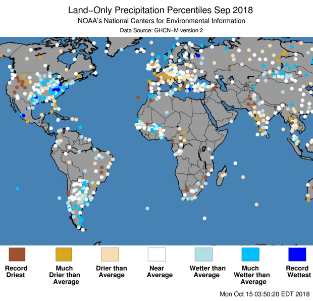
[Precipitation ranks (wettest on record to driest on record) for September 2018. From NOAA NCEI]
Why does the report come out about the 18th of each month and not sooner?
To create a well-written and informative report, we need to take our time to make sure that the data that we have are correct. Thanks to international agreements, countries share weather data with each other. The agreement states that each participating country should submit their monthly weather data by the 10th of the following month.
At NCEI, we receive data from countries, ships, and buoys from around the world. Not only do we archive this data, but they also go through a rigorous process to determine if each data record submitted is a valid record. There are several quality control checks that the value passes through in order to be considered a valid record; and if it doesn’t, then the value gets flagged. For example, a record may not pass a test if it was a duplicate record from a previous month. In one instance, a country mistakenly submitted data that was actually observed in one month but mislabeled it as being observed in another. Another way a record can be flagged is if the value for a station is significantly colder or hotter than neighboring stations are reporting. Once the data have gone through the quality control checks, our scientists use only those values that passed to create gridded datasets for the global land-only, global ocean-only, and combined global land and ocean datasets. [Photo of a Hierarchical Data Storage System. From NOAA]
We not only provide the data for our users, but we also interpret what the data are showing. We take the time to create maps and time series and write a thoughtful report that will answer:
[Photo of a Hierarchical Data Storage System. From NOAA]
We not only provide the data for our users, but we also interpret what the data are showing. We take the time to create maps and time series and write a thoughtful report that will answer:
- What happened?
- Where was it warmer or colder than average and by how much?
- Was this unusual? How does this year rank among previous years?
- Is this part of a trend?
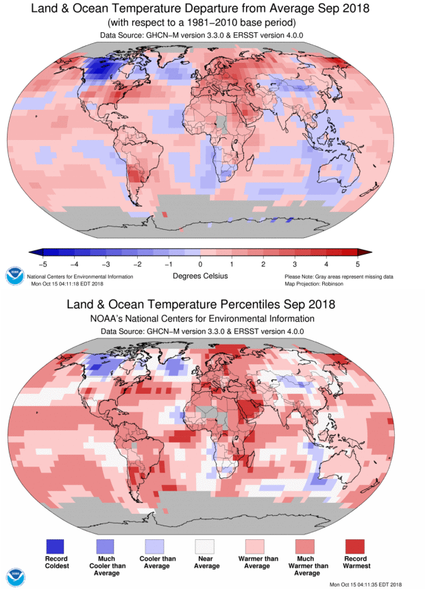 [Global temperature during September 2018, shown in two ways: (top) Temperature anomalies, or the difference from the 1981-2010 average, in degrees Celsius. (bottom) Temperature percentiles, or the September temperature, relative to Septembers past for that grid box. "Near Average" represents the middle tercile (one-third) of history for that grid point. "Warmer/Cooler than Average" represents a September 2018 value among the warmest/coolest third of history. "Much Warmer/Cooler than Average" represents a September among the top ten percent. "Record Warm/Cool" indicates the warmest or coolest September observed at that grid box. At least 80 years of September data are needed for a grid box to be "eligible" for the percentile map.]
What is the difference between the anomalies map and the percentiles map?
Both of these maps are essential to describing the state of the climate across the world. They are derived from the same dataset (NOAAGlobalTemp), but they look at the data through a different set of lenses. The anomalies map informs us which areas were warmer or cooler than the 30-year average and the amount by which it was warmer or cooler than average. The top image shows in red the areas that had warmer than average conditions during September 2018, while the blue shades indicate the areas that had colder-than-average conditions. The different shades of red (blue) indicate how much warmer (or colder) the temperatures was than average. The darker the shade, the greater the difference from average. The percentiles map complements the anomalies map by placing each grid point’s anomaly into a historical perspective, meaning how did that anomaly for the month compare with previous years for that specific grid point. Thus, it shows how the anomaly for a specific grid point ranked in comparison with previous years. The values are ranked from warmest to coolest. The numeric rank represents the position of the value throughout the historical record. What I love about the percentiles map is that it helps show how unusual an anomaly is for each grid point. Even though an anomaly that might look small in comparison to other parts of the world, could actually be record warm for its location. For example, when looking at the temperature anomaly map, your eyes will focus on the regions that had big temperature anomalies like Europe, which had temperatures that were 2.0°C (3.6°F) above average or higher. Meanwhile, the central-eastern Atlantic Ocean (northwest of Africa) had temperatures that were between 0.5°C to 1.0°C (0.9°F to 1.8°F) above average—the warmest temperature departures on record for this location. Additional information on the definition percentiles map legend can be found at our Did You Know article.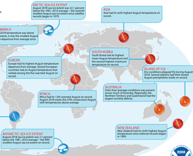 [The Significant Climate Anomalies and Events map from the August 2018 global report, derived in part from information from the world's National Hydrometeorological Services (the National Weather Service is the US example)]
Why does the section with the national information vary from month to month?
The section that provides (inter)national information is based on what is available at the time of analysis. Thankfully, more and more nations across the globe are writing their own national climate assessments to help explain what happened the previous month, season, or year across their countries.
These are not only fascinating to comprehend what happened in a country, but they also help validate our data. Europe, Argentina, and Australia, among others, send reports when we need them in order to release our report in a timely manner. To provide a timely yet informative report, we must use what is available to us at the time we need it.Why does the land-only map have data missing for areas such as Africa, but the combined land and ocean map shows data?
This is a good question that has been asked frequently.
The land-only temperature departure from average map is created using the Global Historical Climatology Network–Monthly (GHCNm) dataset, which is the land component of the combined land and ocean dataset. Meanwhile, the other two maps (temperature departures from average and percentiles) are derived from the NOAA Global Temperature (NOAAGlobalTemp) dataset.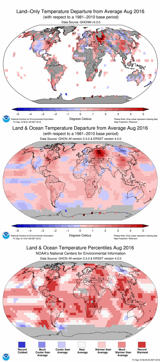 [Global temperature map for August 2016 in three iterations. (top) Using only land observations, differences with respect to the 1981-2010 average, in degrees Celsius; (middle) blended land-and-ocean temperature anomalies, with the same convention; (bottom) percentile map for the month, with the same conventions as previous image, and ranking categories shown as of August 2016.]
Yes, there are some areas that we have little or no data for, like Africa. However, during the merging process between the land-only and ocean-only datasets to create the NOAAGlobalTemp dataset, a statistical analysis takes place that interpolates (use scientific knowledge to fill in gaps) in areas with little to no data.
Interpolating is a common and widely peer-reviewed process which takes into account neighboring data as well as historical information for the region in question in order to determine what the temperature departure from average would be for areas with little to no data. However, we are very conservative in our approach, and sometimes an analysis can’t be done. In those cases, the region will be set to “missing.”
That is why the temperature departures map for land-only might have data missing for a region, but in the merged land and ocean dataset it has data for the same time period. Using the merged land and ocean dataset, we perform the analysis described in question #2 to determine the percentiles for each grid point.
[Global temperature map for August 2016 in three iterations. (top) Using only land observations, differences with respect to the 1981-2010 average, in degrees Celsius; (middle) blended land-and-ocean temperature anomalies, with the same convention; (bottom) percentile map for the month, with the same conventions as previous image, and ranking categories shown as of August 2016.]
Yes, there are some areas that we have little or no data for, like Africa. However, during the merging process between the land-only and ocean-only datasets to create the NOAAGlobalTemp dataset, a statistical analysis takes place that interpolates (use scientific knowledge to fill in gaps) in areas with little to no data.
Interpolating is a common and widely peer-reviewed process which takes into account neighboring data as well as historical information for the region in question in order to determine what the temperature departure from average would be for areas with little to no data. However, we are very conservative in our approach, and sometimes an analysis can’t be done. In those cases, the region will be set to “missing.”
That is why the temperature departures map for land-only might have data missing for a region, but in the merged land and ocean dataset it has data for the same time period. Using the merged land and ocean dataset, we perform the analysis described in question #2 to determine the percentiles for each grid point.
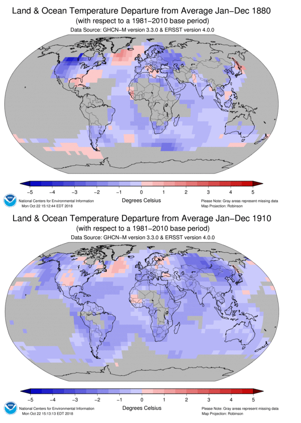 [Annual global temperatures, compared to the 1981-2010 average, for the years 1880 (top) and 1910 (bottom). In the 1880 map, while there is enough data to compute a globally-averaged temperature (with associated uncertainty), there is too little data to compute smaller-scale averages for Asia, South America, and Africa. By 1910, the situation had improved enough to make reasonable estimates of these continental-scale temperatures.]
Why do you change versions of the datasets?
“Just because something works doesn’t mean it can’t be improved.” — Shuri to King T’Challa (Black Panther)
Our current datasets are solid and robust, and they help us understand our globe’s current state of the climate and how it is changing, but we are constantly trying to improve them as technology and our understanding evolve. The two datasets that comprise the NOAAGlobalTemp have been updated (GHCNm v4 and ERSST v5). With the new GHCNm v4 dataset, we are going to have better coverage across the globe’s land surface, including Africa. The new ERSST v5 also includes additional data for SST from different sources that were not previously available to us. Additional information on the datasets can be found at the following links: GHCNm v4: https://www.ncei.noaa.gov/news/noaa-updates-global-temperature-dataset ERSST v5: https://www.ncdc.noaa.gov/data-access/marineocean-data/extended-reconstructed-sea-surface-temperature-ersst-v5 Beginning with the January 2019 global climate report, which will be released in mid-February 2019, NCEI will transition to the new NOAAGlobalTemp (comprised of GHCNM v4 and ERSST v5).


