Notes on the New Climate Normals
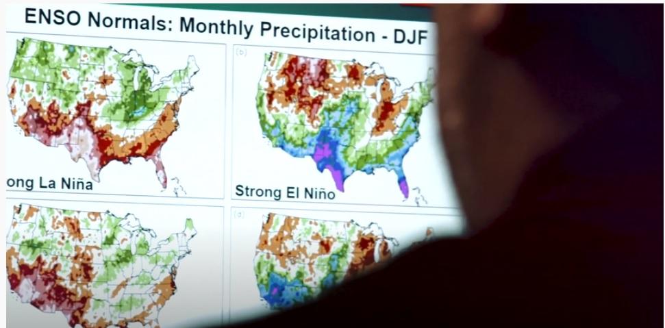
[NCEI climatologist Anthony Arguez reviews El Niño/Southern Oscillation winter precipitation Climate Normals from NOAA for the contiguous United States. Courtesy of NOAA NCEI.]
[Written by NOAA] Every 10 years, NOAA releases an analysis of U.S. weather of the past three decades that calculates average values for temperature, rainfall and other conditions. That time has come again as the new Climate Normals arrived May 4th.
Known as the U.S. Climate Normals, these 30-year averages — now spanning 1991-2020 — represent the new “normals” of our changing climate. They are calculated using climate observations collected at local weather stations across the country and are corrected for bad or missing values and any changes to the weather station over time before becoming part of the climate record.

[A NOAA employee in Asheville, North Carolina resets the index on a pair of minimum/maximum thermometers in a NOAA weather station. The index in the fluid marks the high and low of the day. (NOAA/Bryant Korzeniewski)]
Simply stated: The Normals are the basis for judging how daily, monthly and annual climate conditions compare to what’s normal for a specific location in today’s climate.
For the past decade, the Normals have been based on weather observations from 1981 to 2010. In early May, climate experts at NOAA’s National Centers for Environmental Information (NCEI) issued an updated collection based on the weather occurring from 1991 to 2020. The data set reflects a “new normal” that takes the most recent 30 years of climate change-influenced weather and climate conditions into account. (More: See Climate Normals Explainer and Explaining the New Climate Normals.)
A warmer normal
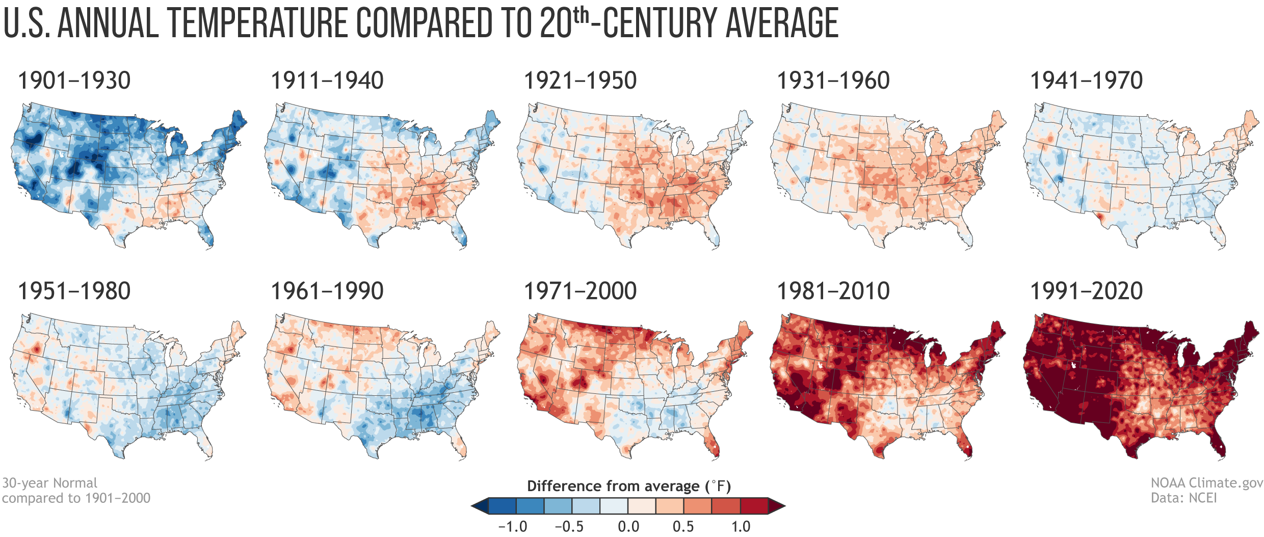 [Annual U.S. temperature compared to the 20th-century average for each U.S. Climate Normals period from 1901-1930 (upper left) to 1991-2020 (lower right). Places where the normal annual temperature was 1.25 degrees or more colder than the 20th-century average are darkest blue; places where normal annual temperature was 1.25 degrees or more warmer than the 20th-century average are darkest red. Maps by NOAA Climate, based on analysis by Jared Rennie, North Carolina Institute for Climate Studies/NCEI. (NOAA Climate)]
The U.S. Climate Normals collection has 10 versions: 1901-1930, 1911-1940 and so on through 1991-2020. In the image below, we’ve compared the U.S. annual average temperature during each Normals period to the 20th-century average (1901-2000). The earliest map in the series has the most widespread and darkest blues, and the most recent map has the most widespread and darkest reds, showing warming.
A wetter normal?
In the collection of precipitation maps, few places exhibit a precipitation trend that is either steadily wetter or steadily drier than the 20th-century average. Instead, drier areas and wetter areas shift back and forth without an obvious pattern.
And yet, it’s probably not a coincidence that the last four maps in the series — the 1961-1990, 1971-2000, 1981-2010 and 1991-2020 Normals — are nationally the four wettest-looking maps in the collection. At least some of that wetness relative to the 20th-century average is linked to the overall climate warming and “wetting” of the atmosphere that’s occurred as rising temperatures cause more water to evaporate from the ocean and land surface.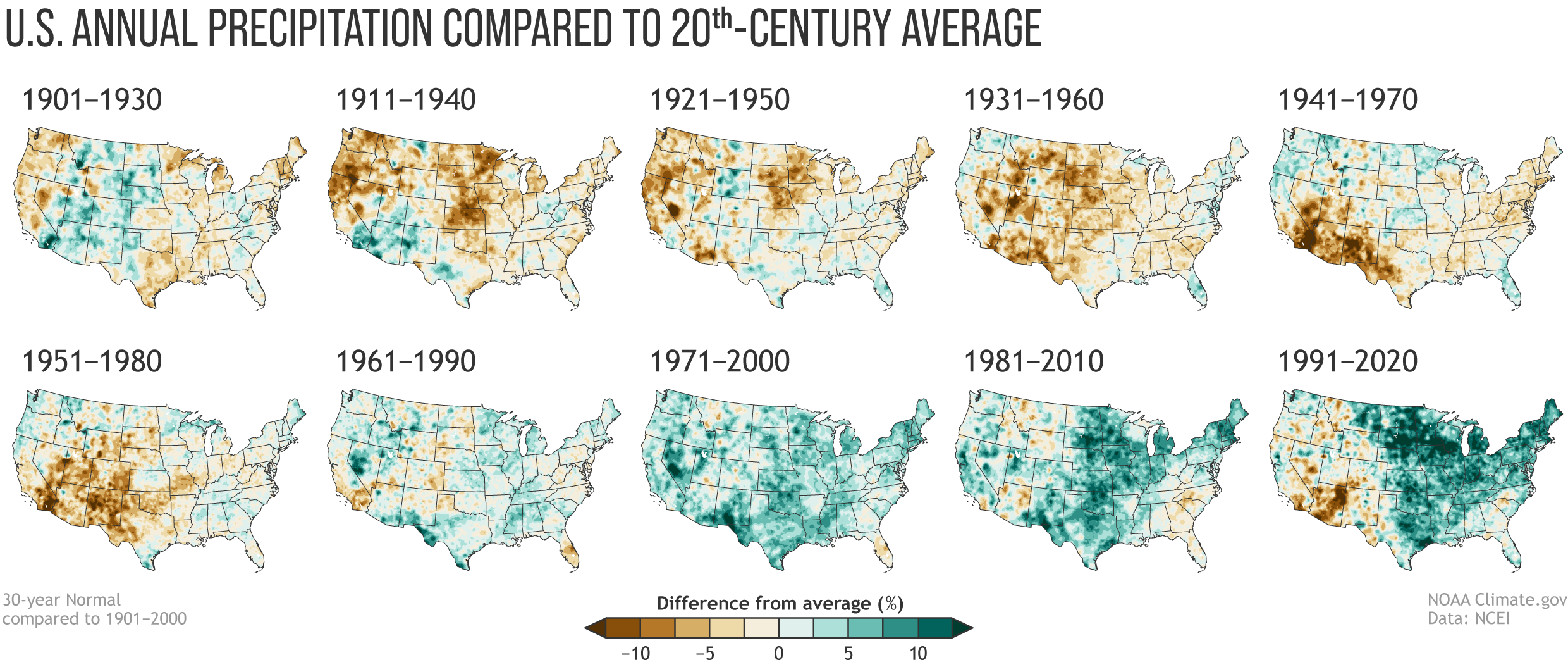 [Normal annual U.S. precipitation as a percent of the 20th-century average for each U.S. Climate Normals period from 1901-1930 (upper left) to 1991-2020 (lower right). Places where the normal annual precipitation was 12.5 percent or more below the 20th-century average are darkest brown; places where normal annual precipitation was 12.5 percent or more wetter than the 20th-century average are darkest green. Maps by NOAA Climate, based on analysis by Jared Rennie, North Carolina Institute for Climate Studies/NCEI.]
What used to be normal
The 1991-2020 Normals tell us what is normal in today’s climate. NOAA scientists conduct other analyses that tell us about what used to be normal.
For example, In NOAA’s monthly and annual climate monitoring reports, temperature averages and precipitation totals are ranked in the climate record dating to 1895; U.S. and global climate conditions are compared to the 20th-century average.
Visualizing climate is easier now than ever
NCEI has a collection of maps showing both recent and long-term trends in temperature and precipitation. You can also create a custom graph showing monthly, seasonal or yearly climate conditions for any region, state and many cities that shows the long-term trend.
Edited for WeatherNation by Mace Michaels


