A Single Index for Measuring Extremes - U.S. Climate Extremes Index
Special Stories
13 Aug 2018 8:13 AM
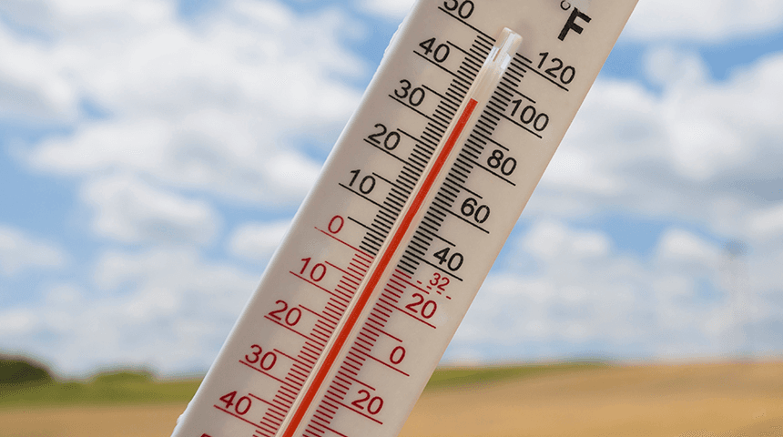
[100 degree thermometer reading from GettyImages/Marccophoto via NOAA]
From NOAA
Let’s boil most of the extreme weather in the United States down to one number. Sounds like a daunting task, doesn’t it? But, the U.S. Climate Extremes Index or USCEI does just that. It tries to describe climate extremes by organizing all of them into one index.
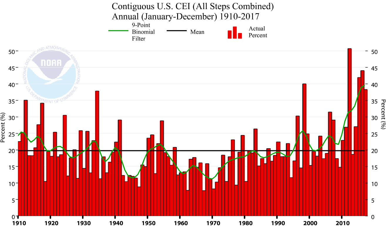
 Because the USCEI looks at the upper and lower 10 percent of extremes, the average area of the country expected to be experiencing extremes is 20 percent. For that reason, observed USCEI values of more than 20 percent indicate “more extreme” conditions than average, while USCEI values less than 20 percent indicate “less extreme” conditions than average.
The USCEI is calculated for eight seasons: spring, summer, autumn, winter, annual, cold season, warm season, and hurricane season. Data and graphs for the most current seasons are updated at the beginning of each month. Scientists have also analyzed extremes across nine standard regions: Northeast, Southeast, Ohio Valley, Upper Midwest, Northern Rockies and Plains, South, Southwest, Northwest, and West.
Because the USCEI looks at the upper and lower 10 percent of extremes, the average area of the country expected to be experiencing extremes is 20 percent. For that reason, observed USCEI values of more than 20 percent indicate “more extreme” conditions than average, while USCEI values less than 20 percent indicate “less extreme” conditions than average.
The USCEI is calculated for eight seasons: spring, summer, autumn, winter, annual, cold season, warm season, and hurricane season. Data and graphs for the most current seasons are updated at the beginning of each month. Scientists have also analyzed extremes across nine standard regions: Northeast, Southeast, Ohio Valley, Upper Midwest, Northern Rockies and Plains, South, Southwest, Northwest, and West.
More specifically, the USCEI brings together several climate indicators to illustrate the occurrence of specific extreme events in the contiguous United States from 1910 to the present. These climate indicators include:
- Extremes in average monthly maximum and minimum temperatures
- Heavy one-day precipitation events
- Drought severity
- The number of days with and without precipitation
- The wind intensity of tropical cyclones that make landfall in the country
How do you calculate the USCEI?
The USCEI tracks the highest and lowest 10 percent of extremes in the previously mentioned climate indicators. One way to visualize how this works is by thinking of a football field.
With temperatures for example, it would be as if the scientists took all of the average monthly maximum, or minimum, temperatures for a specific location and lined them up on a football field from the coolest at one goal line to the warmest at the other goal line. The USCEI incorporates those values that are within the 10-yard line on each end of the field. Scientists can then look at those values and see when most of the high and low extremes occurred, giving them an idea of how they are evolving over time.How do you interpret USCEI values?
A USCEI value of 0 percent is the lower limit of the index. It indicates that no portion of the country experienced any of the extremes included in the index. At the opposite end of the scale, a USCEI value of 100 percent would mean that the entire country had extreme conditions throughout the period for each of the indicators—virtually impossible.
Because the USCEI looks at the upper and lower 10 percent of extremes, the average area of the country expected to be experiencing extremes is 20 percent. For that reason, observed USCEI values of more than 20 percent indicate “more extreme” conditions than average, while USCEI values less than 20 percent indicate “less extreme” conditions than average.
The USCEI is calculated for eight seasons: spring, summer, autumn, winter, annual, cold season, warm season, and hurricane season. Data and graphs for the most current seasons are updated at the beginning of each month. Scientists have also analyzed extremes across nine standard regions: Northeast, Southeast, Ohio Valley, Upper Midwest, Northern Rockies and Plains, South, Southwest, Northwest, and West.
Why track climate extremes?
Scientists don’t track climate extremes just for curiosity’s sake. Important consequences can occur when we experience the extreme behavior of climate. That’s when big decisions need to be made to save lives and safeguard property and livelihoods. The USCEI tries to capture how extremes are affecting us to help better inform the decisions we make when planning for the future. Edited for WeatherNation by Meteorologist Mace MichaelsAll Weather News
More
Severe Storms Target the Midwest This Weekend
Extreme heat will be a big story this week ac
26 Jul 2026 2:15 AM

Heat Wave Grips Central, Western U.S.
Are you over the summer heat yet? The heat al
26 Jul 2026 2:05 AM

Tropics: Fausto Heads to Hawaii; Genevieve Will Become a Major Hurricane
Atlantic BasinBertha has dissipated after mov
26 Jul 2026 2:00 AM


Southeast Flood Risk Lingers Near Stalled Front
A stalled boundary over the Southeast will ke
25 Jul 2026 10:55 AM

Another Round of Storms Targets the Northeast
Tuesday brought severe weather again across p
23 Jul 2026 1:15 AM

Another Round of Severe Weather for the Upper Midwest and Great Lakes
The upper-level low train continues to keep t
21 Jul 2026 1:45 AM