The Making of the Weekly Drought Map
The U.S. Drought Monitor is updated weekly because the information matters to people—for growing crops, managing water supplies, generating power, and fighting wildfires. The USDA uses the map to determine eligibility for monetary relief, and state and local authorities use it to trigger responses related to issues such as reservoir levels.
The stakes are high, and those who use the map aren’t always happy with what they see on it—partly because the USDM reflects several types of drought at multiple time scales, all on a single map. To withstand the criticism, the authors need to have thick skin and confidence in their methods. “We have to basically put force fields around us to deflect the harassment and the political influence,” says Richard Heim, an NCEI scientist and an author of the U.S. Drought Monitor. “The map and process must be totally objective.”Gathering Drought Data
The U.S. Drought Monitor releases maps detailing the location and intensity of drought in the 50 states, Puerto Rico, and U.S.-affiliated Pacific Islands and Virgin Islands. The maps show blobs of yellow, beige, orange, and red, indicating levels on a scale that ranges from Abnormally Dry (D0, yellow) to Exceptional Drought (D4, deep red).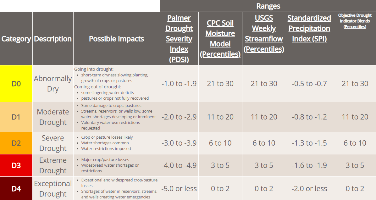
 “There are literally dozens of drought indicators we look at,” Heim says, and sometimes the indicators conflict. “If some of the indices are saying really bad”—i.e., dry—“and a lot of the others are saying really wet, how do you integrate that?”
The answer is known as the “convergence of evidence approach.” The indicators might not all agree precisely, but taken together they point in the same direction.
“You have to mentally assess all of the inputs and make a judgment call,” Heim says. “What are they converging to? That can be hard, and it takes a lot of experience to figure it out.”
“There are literally dozens of drought indicators we look at,” Heim says, and sometimes the indicators conflict. “If some of the indices are saying really bad”—i.e., dry—“and a lot of the others are saying really wet, how do you integrate that?”
The answer is known as the “convergence of evidence approach.” The indicators might not all agree precisely, but taken together they point in the same direction.
“You have to mentally assess all of the inputs and make a judgment call,” Heim says. “What are they converging to? That can be hard, and it takes a lot of experience to figure it out.”
Talking to People in the Field
The U.S. Drought Monitor considers information not just from numerical indicators but also from people. Each week, the data are ground-truthed by a network of more than 450 local field experts, many of them meteorologists, climatologists, and hydrologists. The field experts examine climate data collected at the state level and talk to their own networks of contacts in their local areas, a process that provides crucial linkages between the statistical indicators and the impacts people are experiencing. “The field experts provide summaries of what’s happening on the ground, and that's very valuable,” Heim says. “Drought isn't just the lack of precipitation, it’s also how drought is impacting people.”Differentiating Drought
There’s not just one type of drought. The three key types are:- Meteorological: less precipitation than normal
- Hydrological: how lack of precipitation affects streams, lakes, snowpack, and groundwater
- Agricultural: how lack of precipitation impacts crops and livestock
Using the USDM Map
Maps can be downloaded as static images, but the National Drought Mitigation Center, which posts the weekly map, also offers a variety of other tools on its website. Regional and state maps offer more detailed views than the national map. The Compare Two Weeks page allows viewing of any two maps side by side. The Comparison Slider allows users to choose any two dates and then drag a bar across the map to see the change between one date and another. An Animations page sets a range of maps in motion, showing how drought has expanded and contracted over time. The U.S. Drought Portal at Drought.gov also shares information from USDM.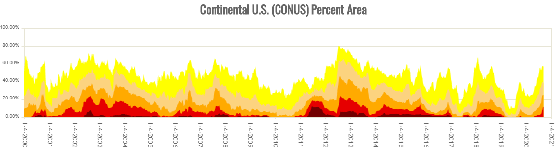 For casual users, Heim recommends using the USDM Time Series option to see how the percentage area of drought in a state or region changes over time. “It's fascinating to see how the trends of drought have changed over the past 20 years,” he says.
Value of the USDM
The U.S. Drought Monitor matters to a lot of people. Corporations use it to make commercial decisions: a manufacturer of snowblowers might ship fewer units to a northern region in the midst of a snow drought. Operators of a nuclear power plant located along a river keep an eye on hydrological drought, because they need a certain level and temperature of streamflow to cool the reactors. Managers of water supply reservoirs, especially in the West, must monitor drought to ensure water keeps flowing to millions of people.
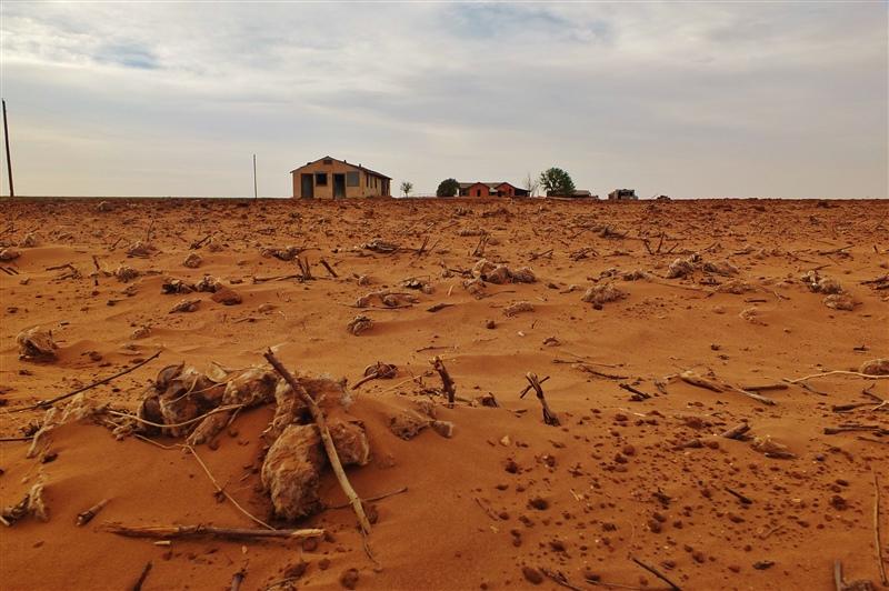
For farmers, the stakes are particularly high. When the U.S. Drought Monitor level hits D3 (Extreme Drought) in their area, farmers become eligible for certain USDA programs that provide financial relief. https://www.youtube.com/watch?v=tugBoQf-hfo&feature=youtu.be “In the past, we have been bombarded with emails and phone calls from farmers and ranchers in areas that are experiencing drought and want us to go D3,” Heim says. Some farmers call their Congressional representatives, who in turn call the scientists at the U.S. Drought Monitor, who must then respectfully explain the USDM’s rigorous scientific methods. “I grew up in Nebraska. My mother grew up on a farm. I have cousins who are farmers,” Heim says. “When a farmer has their crops destroyed by drought, it's a horrible thing, and it would be great if we could do everything we could to help them recover from that.” But changes in a region’s drought status are triggered not by sympathy or political pressure but by the data that is painstakingly assembled and analyzed by U.S. Drought Monitor scientists, week after week. “We follow the methodology,” Heim says. “The U.S. Drought Monitor is a tool that's based upon objective data.” Edited for WeatherNation by Mace Michaels


