Grading the 2020-2021 Winter Outlook
Special Stories
26 Mar 2021 2:00 AM
[From NOAA Climate written by Tom Di Liberto] Ah, spring. Flowers blooming, birds chirping, engrossing ENSO Blog articles verifying the winter outlook. What’s not to like?! So let’s look back at the Climate Prediction Center’s Winter Outlook for 2020-2021 and take a nuanced look at how seasonal outlooks are made.
MATH ALERT! MATH ALERT! (*sirens blaring*) Verification (assessing the extent to which a forecast “came true”) requires some basic statistical knowledge. Head to one of six ENSO Blog posts I’ve written on the topic of forecast verification (yes, six! I’m a big nerd) to dig deeper into the nitty gritty.
For a TL;DR version, a reminder that scientists assign a percent chance that seasonal average temperatures and total precipitation will fall into one of three categories—above average, below average, or near average. The final map you see of the Winter Outlook is simply showing the category that has the highest chance of the three. If all chances are tied (called an equal chance), the location is colored in white. (1)
Why are seasonal forecasts done this way? There is a whole heck of a lot of uncertainty when you make predictions that far into the future. A lot of stuff can happen that couldn’t be foreseen when the forecast was made last fall. That is why you’ll never see probabilities on a seasonal temperature or precipitation forecast map anywhere near 100%. There are too many unpredictable climate “things” that could occur.
Onto the verification of the 2020-2021 Winter Outlook! (2)
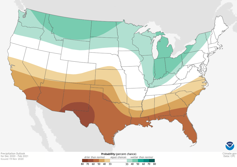 [Winter precipitation outlook for December-February 2020-2021 issued on November 19, 2020. The colors denote places where the forecast odds favor a much drier than usual winter (brown colors) or much wetter than usual winter (blue-green), or where the probability of a dry winter, a wet winter, or a near-normal winter are all equal (white). The darker the color, the stronger the chance of that outcome (not the bigger the departure from average) NOAA Climate map, based on data from NOAA CPC. ]
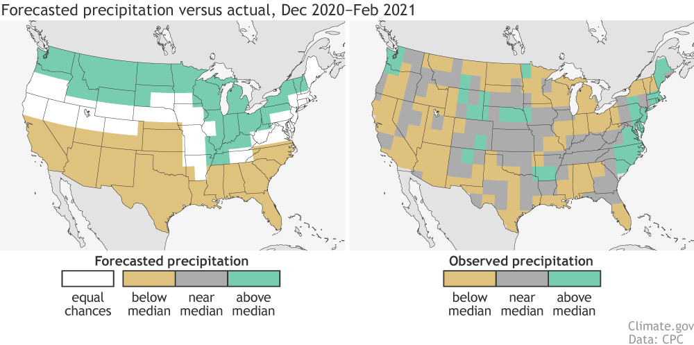 [(left) Precipitation forecast for December-February 2020-21, made in mid-November. The colors show the forecast category with the highest probability. White areas are where all three outcomes (wet, dry, average) were equally likely (each had a 33.3% chance of happening). (right) Observed precipitation category for December-February 2020-21. NOAA Climate image based on CPC data.]
But, as I’ve noted in every verification post I’ve ever written, you should never base how well the forecast did just on how it looks to your eyes. Instead, the scientists at the Climate Prediction Center use a verification metric known as the Heidke Skill Score (HSS) (available here for all NOAA seasonal outlooks). The HSS looks at not just how often the outlook hits or misses the mark, but also how often the forecast would have been right just by luck. Any HSS greater than zero means that the outlook was better than just randomly guessing one of the three categories. The higher the number, the better the forecast.
Taking everything into account, this winter’s precipitation outlook HSS was essentially zero, clocking in at -0.22 for the contiguous US and -0.29 if we just looked at areas where forecasters favored one category over the others (aka all places where the forecast wasn’t equal chances).
[(left) Precipitation forecast for December-February 2020-21, made in mid-November. The colors show the forecast category with the highest probability. White areas are where all three outcomes (wet, dry, average) were equally likely (each had a 33.3% chance of happening). (right) Observed precipitation category for December-February 2020-21. NOAA Climate image based on CPC data.]
But, as I’ve noted in every verification post I’ve ever written, you should never base how well the forecast did just on how it looks to your eyes. Instead, the scientists at the Climate Prediction Center use a verification metric known as the Heidke Skill Score (HSS) (available here for all NOAA seasonal outlooks). The HSS looks at not just how often the outlook hits or misses the mark, but also how often the forecast would have been right just by luck. Any HSS greater than zero means that the outlook was better than just randomly guessing one of the three categories. The higher the number, the better the forecast.
Taking everything into account, this winter’s precipitation outlook HSS was essentially zero, clocking in at -0.22 for the contiguous US and -0.29 if we just looked at areas where forecasters favored one category over the others (aka all places where the forecast wasn’t equal chances).
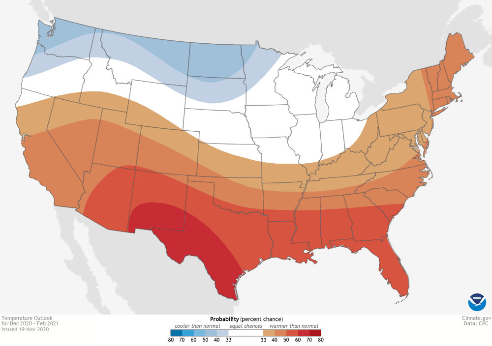 [Winter temperature outlook for December-February 2020-2021 issued on November 19, 2020. The colors denote places where the forecast odds favor a much colder than usual winter (blue colors) or much warmer than usual winter (red), or where the probability of a cold winter, a warm winter, or a near-normal winter are all equal (white). The darker the color, the stronger the chance of that outcome (not the bigger the departure from average). NOAA Climate.gov map, based on data from NOAA CPC.]
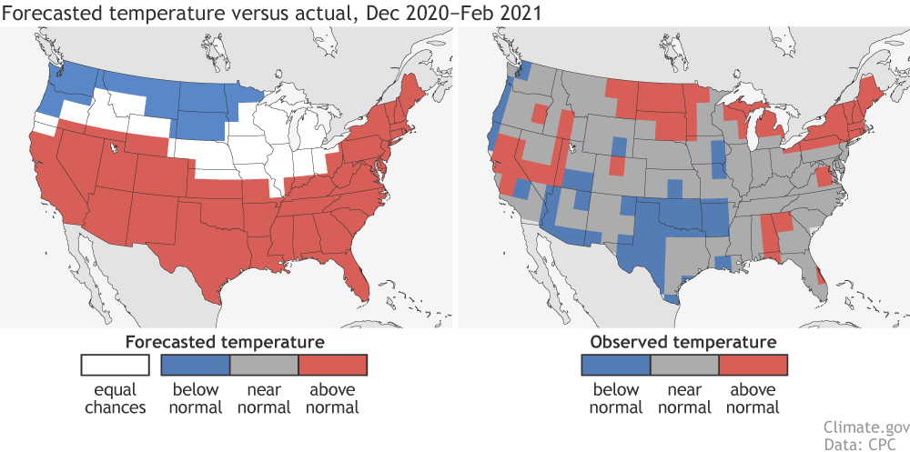 [(left) Temperature forecast for December-February 2020-21, made in mid-November. The colors show the forecast category with the highest probability. White areas are where all three outcomes (warm, cool, or average) were equally likely (each had a 33.3% chance of happening). (right) Observed temperature category for December-February 2020-21. Climate.gov image based on CPC data.]
This corresponded to a HSS of -17, which decreased to -22 when looking only at areas that weren’t equal chances and instead tilted to one of the three categories.
To put these numbers into a broader context, head to CPC’s verification website for the HSS scores for all seasons going back to 1995. You can see that while this past winter outlook was below zero, most seasonal forecasts have HSSs above zero. (4) And if we look at the HSS for only areas that forecasters favored one of the three categories, the average HSS for all temperature winter outlooks is near 30, or a 60% increase in the number of correct forecasts versus random guessing. (5)
Think of it this way: back on September 23, 2020, arguably the best baseball player alive, Mike Trout, went 0 for 4 with three strikeouts. Would you base your opinion of his baseball abilities on that one game? Of course not! Same goes for seasonal outlooks (play the long game).
[(Top) Geopotential height anomalies (m) at the 500 hectopascal (hPa) pressure level during December 2020 through January 2021. Cold colors indicate below-average atmospheric pressure and warm colors indicate above-average atmospheric pressure at a level about three miles above the Earth’s surface. (Bottom) The average 500 hPa geopotential height anomalies from December – January for the 13 strongest La Niña episodes since 1950, including December 2020 through January 2021. Note the different scaling between the top and bottom figures. The top figure has a wider range of values because the top figure includes contributions from both predictable signals, like La Niña, and random weather variability, whereas the bottom figure has filtered out most of the random weather variability. Anomalies are calculated with respect to the 1991-2020 base period for the top figure and with 30-year base periods updated every 5 years (see here for a description). NOAA Climate.gov figure with NCEP/NCAR Reanalysis data obtained from the NOAA Physical Sciences Laboratory.]
[(left) Temperature forecast for December-February 2020-21, made in mid-November. The colors show the forecast category with the highest probability. White areas are where all three outcomes (warm, cool, or average) were equally likely (each had a 33.3% chance of happening). (right) Observed temperature category for December-February 2020-21. Climate.gov image based on CPC data.]
This corresponded to a HSS of -17, which decreased to -22 when looking only at areas that weren’t equal chances and instead tilted to one of the three categories.
To put these numbers into a broader context, head to CPC’s verification website for the HSS scores for all seasons going back to 1995. You can see that while this past winter outlook was below zero, most seasonal forecasts have HSSs above zero. (4) And if we look at the HSS for only areas that forecasters favored one of the three categories, the average HSS for all temperature winter outlooks is near 30, or a 60% increase in the number of correct forecasts versus random guessing. (5)
Think of it this way: back on September 23, 2020, arguably the best baseball player alive, Mike Trout, went 0 for 4 with three strikeouts. Would you base your opinion of his baseball abilities on that one game? Of course not! Same goes for seasonal outlooks (play the long game).
[(Top) Geopotential height anomalies (m) at the 500 hectopascal (hPa) pressure level during December 2020 through January 2021. Cold colors indicate below-average atmospheric pressure and warm colors indicate above-average atmospheric pressure at a level about three miles above the Earth’s surface. (Bottom) The average 500 hPa geopotential height anomalies from December – January for the 13 strongest La Niña episodes since 1950, including December 2020 through January 2021. Note the different scaling between the top and bottom figures. The top figure has a wider range of values because the top figure includes contributions from both predictable signals, like La Niña, and random weather variability, whereas the bottom figure has filtered out most of the random weather variability. Anomalies are calculated with respect to the 1991-2020 base period for the top figure and with 30-year base periods updated every 5 years (see here for a description). NOAA Climate.gov figure with NCEP/NCAR Reanalysis data obtained from the NOAA Physical Sciences Laboratory.]
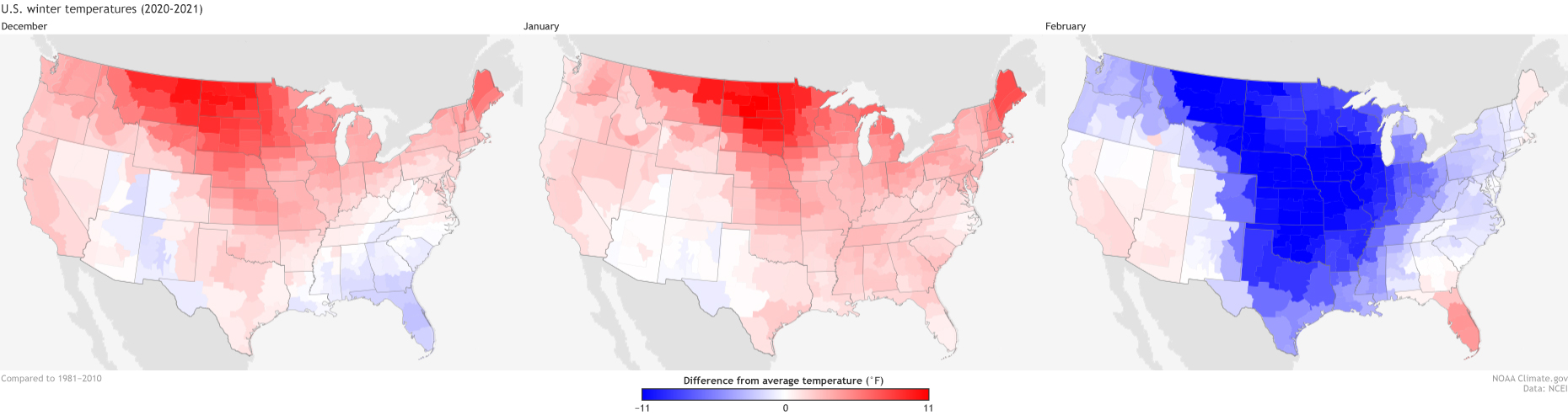 [Temperatures across the Lower 48 in December 2020 (left), January 2021 (right), and February 2021, compared to the 1981–2010 average. Red indicates places that were warmer than average, and blue indicates places that were colder than average. NOAA Climate maps from our Data Snapshots collection, based on data from NCEI.]
And February…well, we’ve written several posts at this point on the sudden stratospheric warming event in January that knocked the polar vortex off-kilter. This stratospheric tumult (and corresponding negative Arctic Oscillation) likely influenced a record-breaking Arctic blast across the central United States during a two-week period in February. Yup, that means the colder-than-average seasonal temperatures in Texas and Oklahoma are simply due to the absolutely freezing temperatures over just a couple weeks during the end of winter. (6)
When you combine all that, you get a winter that barely resembles the La Niña schematic.
[Temperatures across the Lower 48 in December 2020 (left), January 2021 (right), and February 2021, compared to the 1981–2010 average. Red indicates places that were warmer than average, and blue indicates places that were colder than average. NOAA Climate maps from our Data Snapshots collection, based on data from NCEI.]
And February…well, we’ve written several posts at this point on the sudden stratospheric warming event in January that knocked the polar vortex off-kilter. This stratospheric tumult (and corresponding negative Arctic Oscillation) likely influenced a record-breaking Arctic blast across the central United States during a two-week period in February. Yup, that means the colder-than-average seasonal temperatures in Texas and Oklahoma are simply due to the absolutely freezing temperatures over just a couple weeks during the end of winter. (6)
When you combine all that, you get a winter that barely resembles the La Niña schematic.
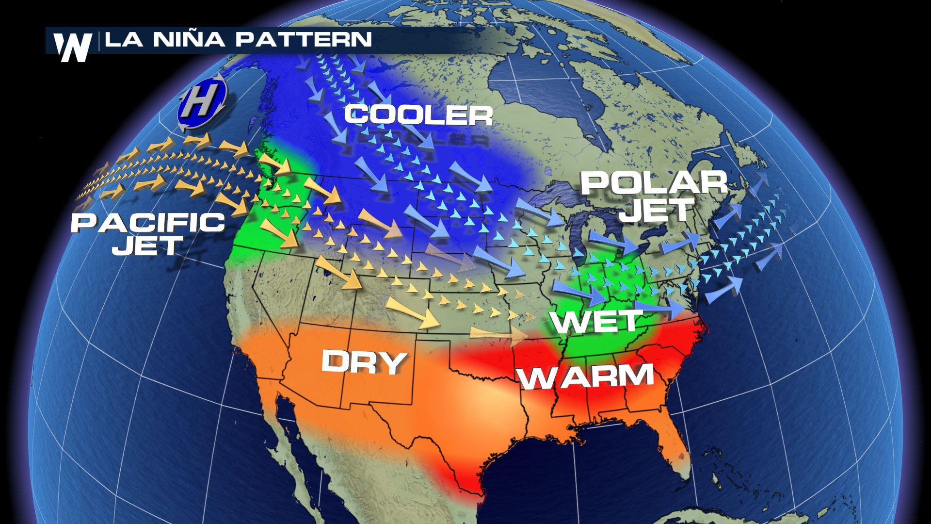
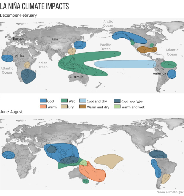
 [Typical impacts of La Niña on U.S. winter temperature and precipitation. Such impacts have been associated with past episodes, but all impacts aren't seen with every episode. NOAA Climate drawing by Fiona Martin.]
[Winter precipitation outlook for December-February 2020-2021 issued on November 19, 2020. The colors denote places where the forecast odds favor a much drier than usual winter (brown colors) or much wetter than usual winter (blue-green), or where the probability of a dry winter, a wet winter, or a near-normal winter are all equal (white). The darker the color, the stronger the chance of that outcome (not the bigger the departure from average) NOAA Climate map, based on data from NOAA CPC. ]
Precipitation outlook COME ON DOWN!
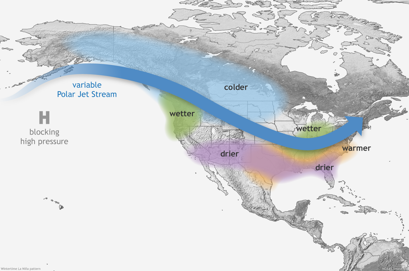
The winter outlook favored wetter-than-average conditions across the northern tier of the US and drier-than-average conditions over the southern tier. This pattern is similar to the precipitation patterns expected during La Niña winters. Which makes sense because we definitely had a La Niña this past winter. What transpired was more on the drier side for most of the country. While much of the dry signal verified across the southern tier, the dryness that extended to the northern tier of the United States was not expected. In contrast, the Pacific Northwest and the eastern seaboard observed a wetter-than-average winter. This meant the forecast verified for the South and the Pacific Northwest, but not for the Mid-Atlantic through coastal Northeast.
[(left) Precipitation forecast for December-February 2020-21, made in mid-November. The colors show the forecast category with the highest probability. White areas are where all three outcomes (wet, dry, average) were equally likely (each had a 33.3% chance of happening). (right) Observed precipitation category for December-February 2020-21. NOAA Climate image based on CPC data.]
But, as I’ve noted in every verification post I’ve ever written, you should never base how well the forecast did just on how it looks to your eyes. Instead, the scientists at the Climate Prediction Center use a verification metric known as the Heidke Skill Score (HSS) (available here for all NOAA seasonal outlooks). The HSS looks at not just how often the outlook hits or misses the mark, but also how often the forecast would have been right just by luck. Any HSS greater than zero means that the outlook was better than just randomly guessing one of the three categories. The higher the number, the better the forecast.
Taking everything into account, this winter’s precipitation outlook HSS was essentially zero, clocking in at -0.22 for the contiguous US and -0.29 if we just looked at areas where forecasters favored one category over the others (aka all places where the forecast wasn’t equal chances).
[Winter temperature outlook for December-February 2020-2021 issued on November 19, 2020. The colors denote places where the forecast odds favor a much colder than usual winter (blue colors) or much warmer than usual winter (red), or where the probability of a cold winter, a warm winter, or a near-normal winter are all equal (white). The darker the color, the stronger the chance of that outcome (not the bigger the departure from average). NOAA Climate.gov map, based on data from NOAA CPC.]
Temperature outlook
The 2020–21 winter temperature outlook predicted a tilt in the odds towards warmer-than-average temperatures across the southern tier of the United States and across the entire East Coast. A colder-than-average winter was favored across parts of the northern tier of the United States from Minnesota to Oregon/Washington. As with precipitation contrasts, the north-south temperature split is also a typical La Niña winter pattern. Winter 2020–21 had other ideas. While it was warmer than average across the Northeast, it was also warmer than average in the northern plains, Great Lakes, and inter-mountain West. Meanwhile across the southern tier of the United States from Texas to Arizona, winter temperatures were below-average. And a substantial part of the country experienced near-average temperatures which are very challenging to forecast correctly. (3)
[(left) Temperature forecast for December-February 2020-21, made in mid-November. The colors show the forecast category with the highest probability. White areas are where all three outcomes (warm, cool, or average) were equally likely (each had a 33.3% chance of happening). (right) Observed temperature category for December-February 2020-21. Climate.gov image based on CPC data.]
This corresponded to a HSS of -17, which decreased to -22 when looking only at areas that weren’t equal chances and instead tilted to one of the three categories.
To put these numbers into a broader context, head to CPC’s verification website for the HSS scores for all seasons going back to 1995. You can see that while this past winter outlook was below zero, most seasonal forecasts have HSSs above zero. (4) And if we look at the HSS for only areas that forecasters favored one of the three categories, the average HSS for all temperature winter outlooks is near 30, or a 60% increase in the number of correct forecasts versus random guessing. (5)
Think of it this way: back on September 23, 2020, arguably the best baseball player alive, Mike Trout, went 0 for 4 with three strikeouts. Would you base your opinion of his baseball abilities on that one game? Of course not! Same goes for seasonal outlooks (play the long game).
[(Top) Geopotential height anomalies (m) at the 500 hectopascal (hPa) pressure level during December 2020 through January 2021. Cold colors indicate below-average atmospheric pressure and warm colors indicate above-average atmospheric pressure at a level about three miles above the Earth’s surface. (Bottom) The average 500 hPa geopotential height anomalies from December – January for the 13 strongest La Niña episodes since 1950, including December 2020 through January 2021. Note the different scaling between the top and bottom figures. The top figure has a wider range of values because the top figure includes contributions from both predictable signals, like La Niña, and random weather variability, whereas the bottom figure has filtered out most of the random weather variability. Anomalies are calculated with respect to the 1991-2020 base period for the top figure and with 30-year base periods updated every 5 years (see here for a description). NOAA Climate.gov figure with NCEP/NCAR Reanalysis data obtained from the NOAA Physical Sciences Laboratory.]
What the heck happened?
Luckily, I don’t have to be the one to answer that, because my fellow ENSO Bloggers have already done the hard work. Last month, Nat took a look at the atmospheric patterns during December and January and found that, hoo boy, they did not look like a typical La Niña pattern, even though we had a moderate-strength La Niña event during the entire winter. In fact, this past December–January was the least La Niña-ish pattern of 13 moderate-to-strong La Niñas dating back to 1950. Why? Who knows! But the influence of chaotic weather variability is always there. Yes, even during a La Niña, mother nature can just BE that way sometimes.
[Temperatures across the Lower 48 in December 2020 (left), January 2021 (right), and February 2021, compared to the 1981–2010 average. Red indicates places that were warmer than average, and blue indicates places that were colder than average. NOAA Climate maps from our Data Snapshots collection, based on data from NCEI.]
And February…well, we’ve written several posts at this point on the sudden stratospheric warming event in January that knocked the polar vortex off-kilter. This stratospheric tumult (and corresponding negative Arctic Oscillation) likely influenced a record-breaking Arctic blast across the central United States during a two-week period in February. Yup, that means the colder-than-average seasonal temperatures in Texas and Oklahoma are simply due to the absolutely freezing temperatures over just a couple weeks during the end of winter. (6)
When you combine all that, you get a winter that barely resembles the La Niña schematic.
[Typical impacts of La Niña on U.S. winter temperature and precipitation. Such impacts have been associated with past episodes, but all impacts aren't seen with every episode. NOAA Climate drawing by Fiona Martin.]
Predicting the predictable
Why do forecasters look to ENSO for help in predicting the winter season if, like this past winter, sometimes it doesn’t seem to matter? Because over the long term, one of the two major sources of skill in the outlooks is the state of ENSO (the other is the temperature trend). It’s one of the best bets we’ve got. When making winter forecasts back in mid-October and mid-November, it was beyond our ability to forecast the strength, timing, or even existence of the sudden stratospheric warming that impacted January-February (and subsequent surface temperature impacts during February). That’s because these events are currently only predictable a week or two in advance. When forecasters are making the outlook, they must predict what is predictable. And then, armed with the knowledge of ALL the things that could also happen that winter that are not possible to predict, make their probabilities for each of the three categories reflect that uncertainty. That’s why the forecasts are in probabilities. There is simply too much we know we don’t know about the future.Footnotes
(1) Confused? Let’s look at temperatures as an example. For any point on the winter outlook, there are three temperature forecasts being made. One for the chance of above-average temperatures. One for the chance of below-average temperatures. And one for the chance of near-average temperatures. When added up, the probabilities of each forecast together equal 100%. (2) This links to a post describing the Winter Outlook made in October for the 2020-21 winter. This post, though, is verifying against the Winter Outlook made in November. (3) It’s important to note that through the first two months of winter (December-January) temperatures were above-average for basically most if not all of the contiguous United States. The cold experienced in February tilted the seasonal temperature number that much! (4) In fact, the average HSS of all forecasts is around 15 (~16 for just winter forecasts), well above zero. (5) How did we figure that out? The HSS equation is HSS = 100*(H-E)/(T-E), where H is the number of correct forecasts, E is the expected number of correct forecasts by luck, and T is the total number of forecasts. If there were 150 total forecasts, that means 50 random forecasts would be expected to verify by luck, or one-third of 150. Therefore, an HSS of 30 would correspond with 80 correct forecasts (100*(80-50)/(150-50)). 80 is 60% higher than 50. (6) For much of winter, the Arctic Oscillation was negative. This not only likely influenced the ice/snow amounts across the South, Mid-Atlantic and Northeast, but also kept the southern tier in the East (the Gulf Coast and Southeast) wetter. This meant there was a variation in above, near and below-normal precipitation in areas where normally La Niña would support drier conditions. Edited for WeatherNation by Mace MichaelsAll Weather News
More
Storms Return From the Front Range to Texas
Moisture is moving back into the Central and
10 Jul 2025 10:45 PM

Medium Range Tropics Forecast Favors Gulf, CSU Updates Seasonal Forecast
While the Atlantic appears quiet, conditions
10 Jul 2025 10:40 PM

Severe Thunderstorms Expected Across the East Coast
The severe weather and flood threat continues
10 Jul 2025 10:30 PM

Rounds of Severe Storms to Impact Great Plains and Midwest Through the Weekend
A dynamic summer weather pattern is setting t
10 Jul 2025 10:25 PM

Timeline: How Catastrophic Flooding Unfolded in Texas Hill Country
TEXAS - Catastrophic flooding devastated port
10 Jul 2025 10:00 AM

Ruidoso Flash Flooding - Record Crest for the Rio Ruidoso River
A slow-moving monsoonal thunderstorm develope
10 Jul 2025 1:55 AM
